Tips to Up Your Email Design Game
You open them every day. The digital communication we all know and love (for the most part)—email. Email is a mainstay in today’s digital marketing and communications. The average office worker receives 121 emails daily. That means any email communication you send is competing with several others to be opened by your recipient. And we’ve all received a questionable-looking email with illegible fonts, clashing color schemes or it simply looked … boring. That’s what we want to avoid when communicating to our audience. Here are some ways to improve the look of your email communications:
Mobile vs. Desktop
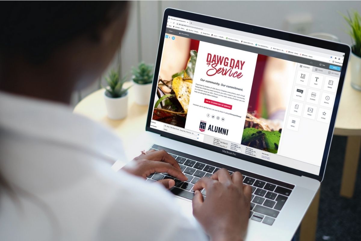
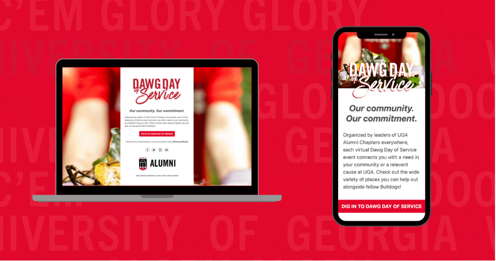
Email layout and design will appear differently when viewing on mobile or desktop. Your email may look beautiful when you pull it up on a laptop but you may find the same email looks a little wonky on a phone. That’s why it’s important to design for both mobile and desktop (mobile-first as the majority of our audience reads emails on phones). Utilize the “Hide on mobile or desktop” feature in Bee to optimize your layouts. Don’t forget to preview both versions as well!
Play With Color
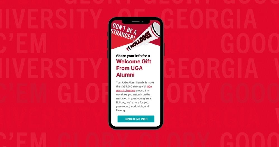
Of course, the University of Georgia is recognizable by our tried-and-true colors—red and black. But we’re not limited to only using those in our design! We have plenty of secondary colors within UGA’s visual brand style to accent and complement our primary colors. Don’t be afraid to use Lake Herrick as a button color or Glory, Glory as a link color. You can even switch up the background color. Rather than Chapel Bell White, try Creamery. The possibilities are endless and adding touches of secondary brand colors can provide the visual interest needed for your recipient to engage with your content.
Less Text is More
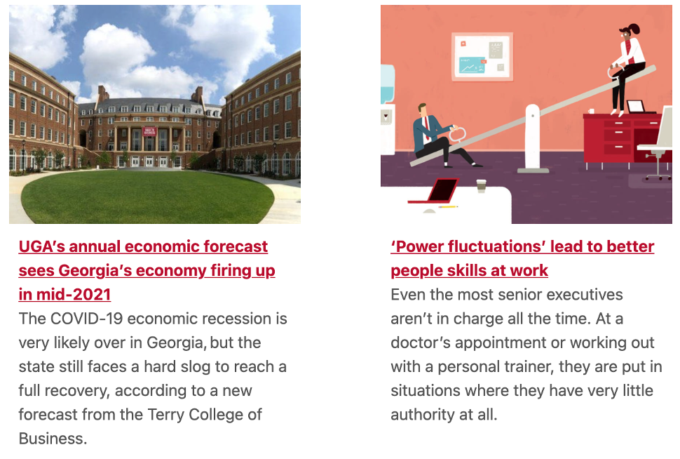
No one wants to navigate their way through a long, dense email. Especially on a mobile device where the scrolling seems endless. Don’t lose your audience midway through an email because it’s too long. Shorter and sweeter is always better. Have a newsletter with a lot of text-heavy content? Hyperlinking is your best friend. Rather than copy and pasting the entire text of an article, give a short summary that makes your audience want to find out more and link out to the full article (not to mention it helps with tracking click rates). This will instantly cut down the word count of your email and refine the layout.
Line Spacing and Margins
Though not as fun to think about as color schemes and device optimization, considering your line spacing and margin sizes are equally important. With any body text, you’ll want to ensure you have double rather than single spacing. Additionally, keeping the margins between 30px-40 px is ideal. It makes it easier to read and gives enough breathing room so that your message doesn’t look dense or squished. Make sure large title text (18px and above) like a header is single spaced. Otherwise, some email servers will alter the line spacing to accommodate for the size of the text. Don’t give them the opportunity to mess up your email (I’m looking at you Gmail)!
Test, test, test!
Last but certainly not least, test your emails! You should send any email communication to yourself first and check on both mobile and desktop. It’s a good practice to even check on light and dark mode as images and text will appear differently.
Implementing these tips will refine your email design and effectively elevate the look of your communications!


