There Will Be Bleed (and other design terms you should know)

Sorry to disappoint everyone; this isn’t a true crime scenario. Sometimes, it can seem like designers speak their own language, and this post will break it down for you:
PRINTING
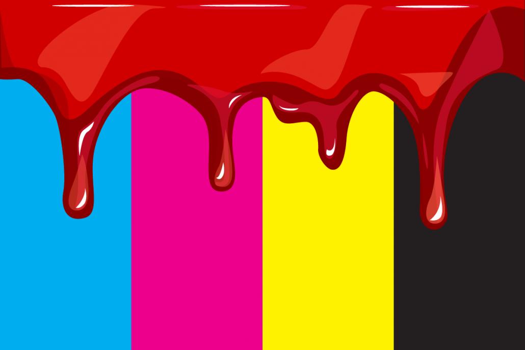
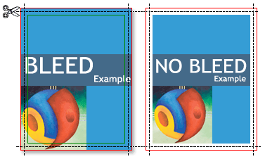
Bleed – In the print design world, bleed is printing that goes beyond the edge of where the sheet will be trimmed. Graphic designers and printers use a standard .125” bleed on all printed pieces (except in some rare special circumstances). This gives the printer a safe-area in case the paper moves for any reason during the printing process.
Lorem ipsum – This is dummy text that is used as a placeholder in a design when the copy isn’t ready or finalized, and you may hear us say something like “We want to show you the design layout with Lorem ipsum.” . Lorem ipsum has been the industry’s standard for filler text since the 1500s, but the scrambled Latin words actually come from sections 1.10.32 and 1.10.33 of “de Finibus Bonorum et Malorum” (The Extremes of Good and Evil) by Cicero, written in 45 BC. Although we prefer to have copy ready, you will find us using Lorem ipsum in drafts once in a while. Then again, if we’re in a good mood, you may find a little Hipsum, some Cat Ipsum, or a little sweet Cupcake Ipsum. If you need to generate Lorem ipsum for yourself, this website has everything you need!
Resolution – The amount of detail an image has determines its resolution. A lower resolution image has fewer pixels; therefore, it will appear “pixelated,” muddy or fuzzy. An image with a higher resolution can be printed at larger formats, has more detail, and is crisper visually. Resolution is often described in terms of dots per inch (DPI) for printed materials and pixels per inch (PPI) for digital media. Images must be 140DPI or higher for print while the standard for digital work is always 72PPI.
Mockup – This is a realistic representation of how the design will look. You may find us printing and assembling things to show you a “mockup” in real life if it’s something that’s difficult to visual on-screen. Beware – they’re not always to scale and definitely not the prettiest! But they get the job done. We create digital mockups as proofs as well, but it just depends on the project!
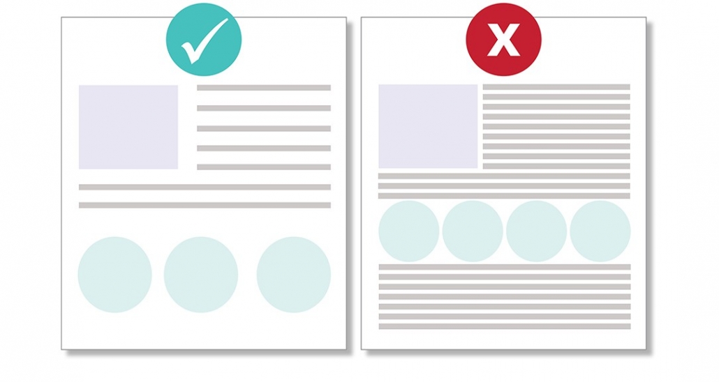
Negative Space – White space is your friend! You may hear us mention white space or negative space, and they mean the same thing. This refers to the space between the elements. Negative space between paragraphs and around blocks of text actually help people understand what they are reading more easily. Trust us! Research proves it! Don’t feel like you need to fill everything with copy or images – let the piece breathe! Negative space communicates elegance and freshness.
Screen printing –Most of DAR’s t-shirts are screen printed, but there’s more than one way to print on fabric! Another way is known as direct-to-garment printing (DTG). Here’s an extremely helpful video that explains the difference between screen printing and DTG. I highly recommend watching.
FPO – For Placement Only. You may see this on a draft over a design element or photo that hasn’t been finalized yet. FPO is often placed at an angle in a different color so we all know it’s not final and needs to be updated. Here’s an example. We don’t use this too often in DAR, but it’s helpful to know in case you see it in the future!
COLOR
PMS – The Pantone Matching System (PMS) is a standardized color reproduction system for printing. Every Pantone shade is numbered allowing for easier reference and identity. For example, PMS 200 is our “Bulldog Red” and PMS 7527 is the Pantone color for “Creamery” in our brand. We chose the nicknames, but the PMS number is universal. Pantone introduces a “Color of the Year” each year, and that color shows up in fashion, design, products, etc. throughout the year. Living Coral is Pantone’s 2019 Color of the Year so you may see that spring up more often in your life!
CMYK – CMYK is a subtractive color model that is used for print purposes. CMYK colors begin as white and then get darker as more colors are combined. CMYK stands for cyan, magenta, yellow and black. If you look at a newspaper under a magnifying glass, you will see tiny cyan, magenta, yellow, and black dots that compose the overall picture – that’s CMYK in action! CMYK is the universal color model that all printers use. Pantone is a brand, and it can be costly or inefficient for printers to purchase inks in large quantities from them. Very often, they will use your PMS color code to calibrate the CMYK inks to match your desired color.
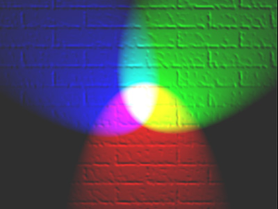
RGB – This is an additive color model that depends on an electronic system (computer, television, camera, etc.). Red, green, and blue light are added together in various ways to reproduce a broad array of colors. Adding two primary colors together produces a secondary color; adding all three creates white.
HEX – A hex color model uses a six-digit hexadecimal values in HTML, CSS, and design software applications to represent colors. You may recognize #000000 or #FFFFFF for black or white, respectively. The HEX code for our Bulldog red is #BA0C2F.
TYPOGRAPHY & TYPE DESIGN
This website is extremely valuable when learning about typography and the rules that govern type design. Check it out!
Serif – Typefaces with small decorative strokes found at the end of horizontal and vertical lines are known as serifs. Serifs tend to look more traditional and work nicely in body copy. UGA brand example – Merriweather.
Sans Serif – serif typefaces are more modern and do not have decorative strokes on the letters. UGA brand example – Trade Gothic
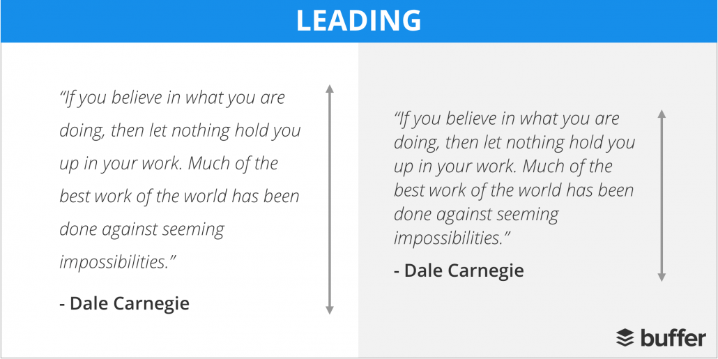
Leading – This is the space between lines of text.
Kerning – The adjustment of space between characters in type. Kerning helps achieve a more proportional and pleasing balance of space between each character, but it also alleviates some awkward situations! Here are some cringe-worthy examples of kerning gone wrong!
Alignment – Center, left, right and justified are each ways to line up elements to achieve balance, order and a more logical layout. While it may seem like everything would look better centered, please be open to other options! Each type of alignment has its own time and place in a design, and the beauty of design is finding that balance! A designer may say “flush left” or “flush right” when referring to which side of the document/column a body of text is aligning.